Customizing the Footer
You can customize the footer by going to Admin → Configuration → Branding, in the footer tab. On default there's no configuration and the interface will look like this:
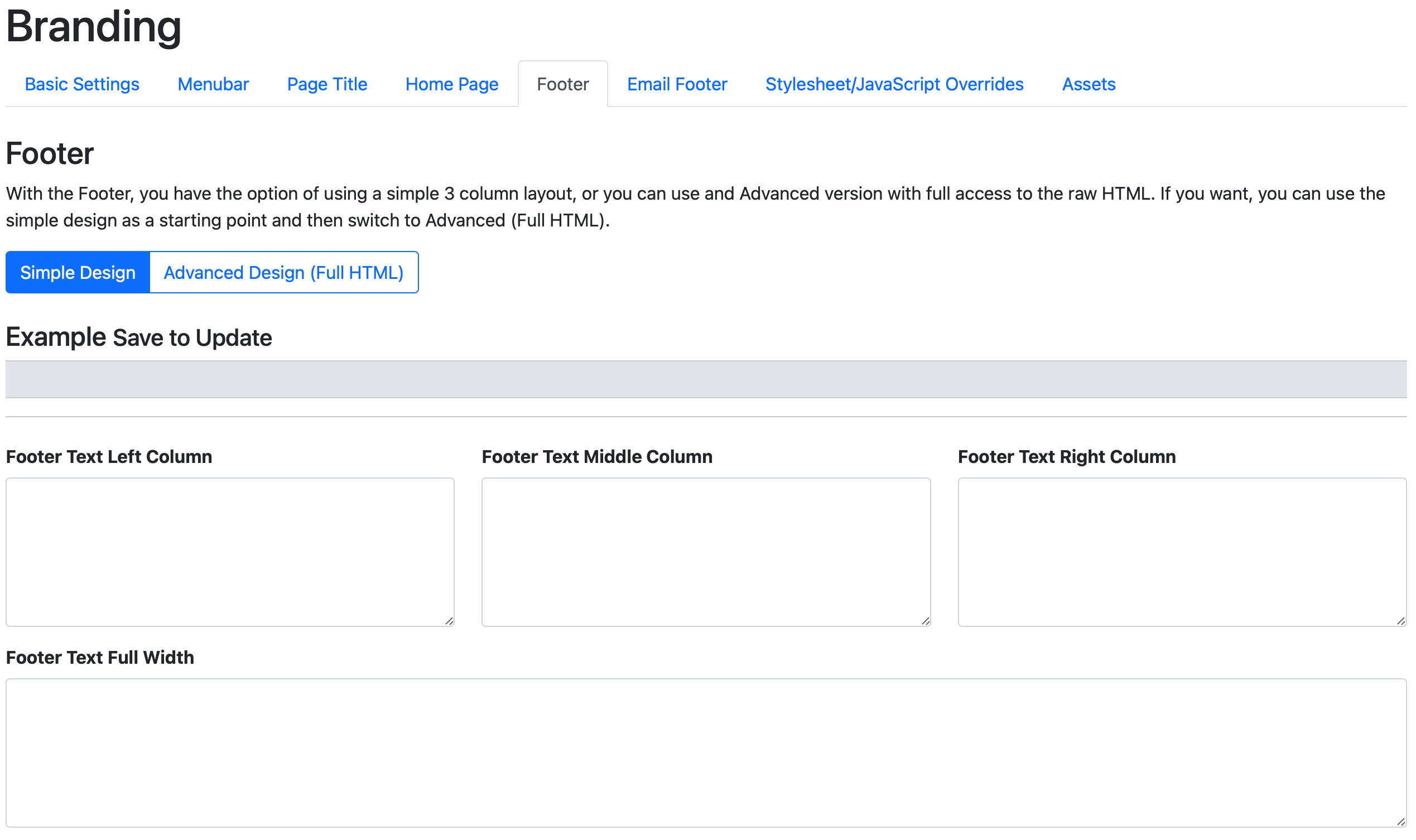
You can use either left, middle, center or the full with option, or use the Advanced Design with full HTML as needed.
Added Terms and Conditions Modal
<button class="btn btn-outline-secondary" data-bs-toggle="modal" data-bs-target="#termsmodal">
  Terms & Conditions
</button>
This configuration can be found in Admin → Branding → Footer.
The footer can be used for branding, displaying T&C's and so on. Here's a starting point that you can paste for instance in the middle column:
<button class="btn btn-outline-secondary" data-bs-toggle="modal" data-bs-target="#terms_and_conditions">
  Terms & Conditions
</button>

<div class="modal fade" id="terms_and_conditions" tabindex="-1">
  <div class="modal-dialog">
    <div class="modal-content">
      <div class="modal-header">
        <h5 class="modal-title" id="exampleModalLabel">Terms & Conditions</h5>
        <button class="btn-close" data-bs-dismiss="modal"></button>
      </div>
      <div class="modal-body">
        Some Terms & Conditions...
      </div>
      <div class="modal-footer">
        <button class="btn btn-outline-secondary" data-bs-dismiss="modal">Close</button>
      </div>
    </div>
  </div>
</div>
Please see:https://getbootstrap.com/docs/5.0/components/modal/ for more information on how to use modal windows.